Challenges
Too much information with no clear focus.
Users had to manually sift through data.
My Approach
To address the issues, I focused on:
Case Study
1. Interactive Infographic Dashboard (Streamlit)
A static report overloaded with text, making it hard to extract
key insights.
I designed an interactive infographic-style dashboard that allows users to explore data through dynamic visual elements. By integrating color-coded metrics and real-time updates, the dashboard became an engaging, decision-driving tool.
2. Data Storytelling Dashboard (Tableau)
A spreadsheet-like display where users struggled to interpret
data trends.
I restructured the dashboard using advanced Tableau visualizations, turning raw numbers into compelling narratives. With interactive charts and trend analysis tools, users can now uncover patterns at a glance, leading to faster and more informed decisions.
3. Customized Theme Dashboard (Power BI)
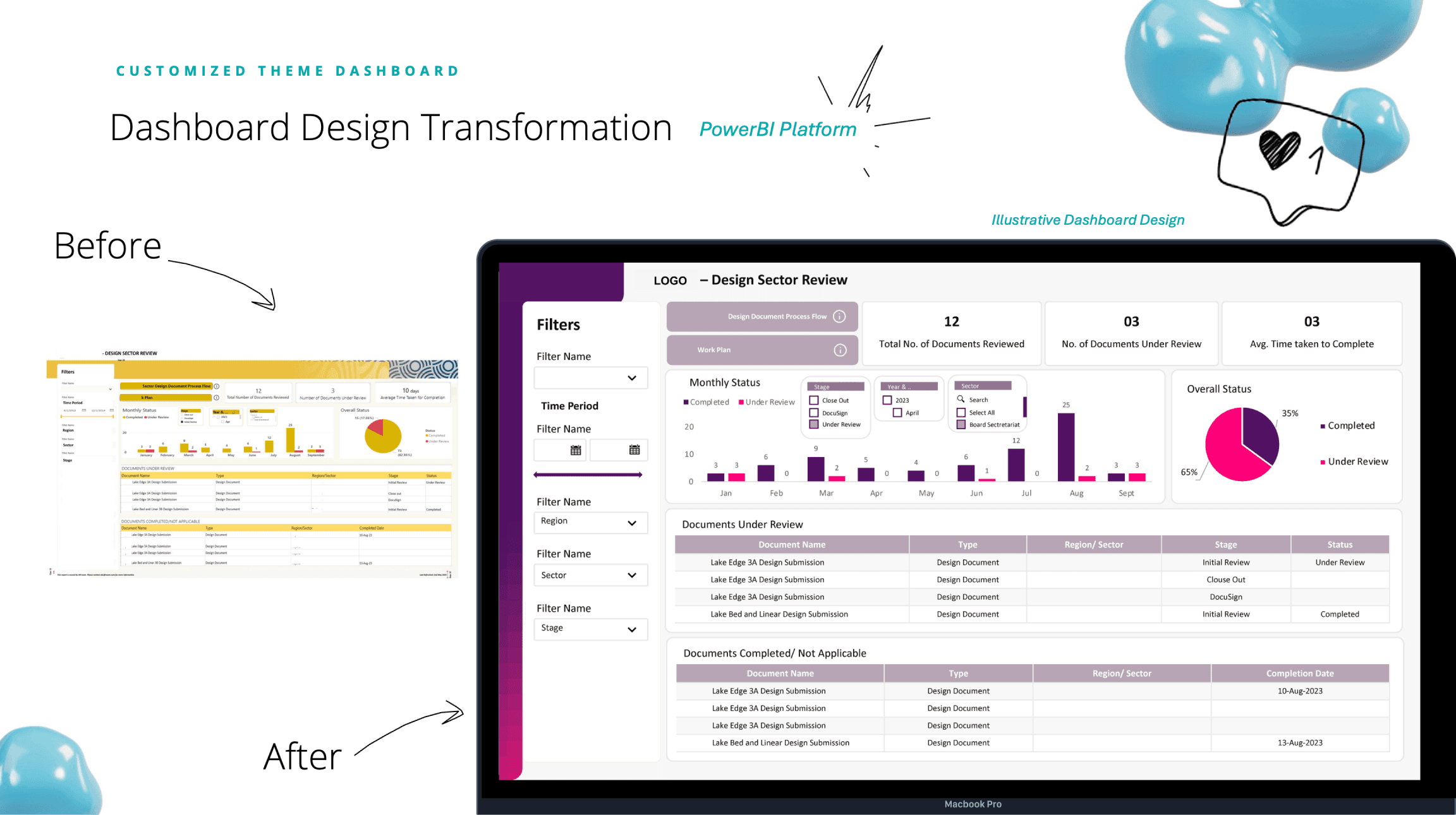
A generic, inconsistent dashboard lacking a professional touch.
By applying a customized theme, I created a visually cohesive experience that aligns with brand identity. The redesign not only enhanced usability but also reinforced credibility and trust in the dashboard’s insights.
4. Status Update Dashboard (PowerApps)
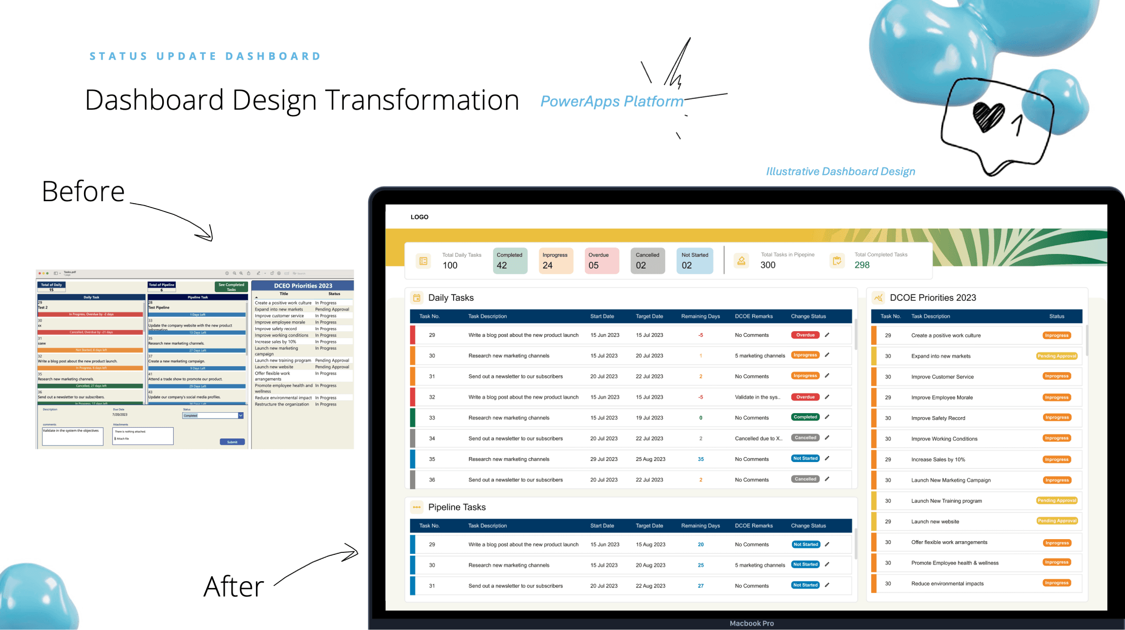
A manually updated status tracker, prone to delays and errors.
I built an automated, interactive dashboard that updates in real-time, reducing manual effort and improving operational efficiency. By enabling instant status changes and notifications, the dashboard streamlined workflows and saved valuable time.